An in-depth analysis of
“What is ‘JoJo’?”
What are the thoughts behind the complete re-creation of the anime?
Recreating the original manga with the concept of “Study JoJo scientifically”
The request from producer Hiroyuki Omori of Warner Brothers Japan for the production of the JoJo anime was very simple: “Make JoJo.” In response, the director, Naokatsu Tsuda, came up with the slogan, “Study JoJo scientifically.”
He picked out all the elements that made the original JoJo manga unique and searched for ways to reproduce them in animation. He thoroughly recreated unique onomatopoeic sounds such as “Memetaa” and “Gogogogo,” as well as the unique poses, and theatrical dialogue such as “I’m impressed by that! I admire you!” On top of these, he also replicated the use of motion lines and frame layout direction in the animation.
Toshiyuki Kato, who has been directing since the first season, said, “In order to create an eerie atmosphere, there are many depictions of fog, smoke, and other unidentifiable gases swirling around in the original manga. Normally, this would have been done with CG, but we recreated it by hand, just like the original manga. In addition, when we wanted to express the disturbance of the characters, we used suspenseful techniques such as darkening the entire face with tones and illuminating only the eyes, just as in the original manga.” The staff’s attention to detail can be seen everywhere.
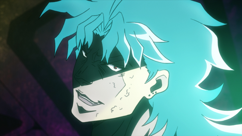
An impressive shot of Dio’s eyes glowing mysteriously while half of his face is covered in shadow.
The “special scene coloring” is the best part of the anime
One notable visual effect is a color expression called “special scene coloring” or “special cut coloring.” As JoJo fans know, there is no fixed color scheme for JoJo. It is quite common for the same character in a color manuscript drawn by Hirohiko Araki to change color drastically from one time to the next, and the fact that he is not bound by a set color scheme is one of the things that makes him unique.
However, unlike manga manuscripts, which are usually drawn in black and white, animation is always in full color. It is not possible to change the colors with every scene. Therefore, Tsuda and his team decided on a basic color scheme that would serve as the overall base, and then adopted “special scene coloring” and “special cut coloring” to change the colors based on developments in the story. These colors are used when the character’s emotions are greatly shaken, or when the story reaches a climax, and they function effectively as accents. It is a concept that takes full advantage of the characteristics of animation, and was retained as a major strength until the fourth season.
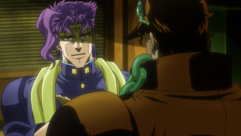
In “special color” scenes, the colors of things like uniforms and hair change.
This is handled differently in each season.
Character designs that seek the median of fan’s imagination
The character design was a particular point of trial and error in the visual construction of the first season. The characters drawn by Hirohiko Araki in the early days were all muscular and had a drawing style similar to gekiga. It is hard to say that this is in line with modern trends, so the challenge was how to bridge this gap. The production team created character designs that were closer to the mental image of the fans by finding the median value of the character designs from the third to fifth parts of the original manga, since those are the character designs that most JoJo fans imagine, and then bringing that back to the first season. The characters created in this way are generally mild and casual, while retaining the strong atmosphere of the early Araki characters.
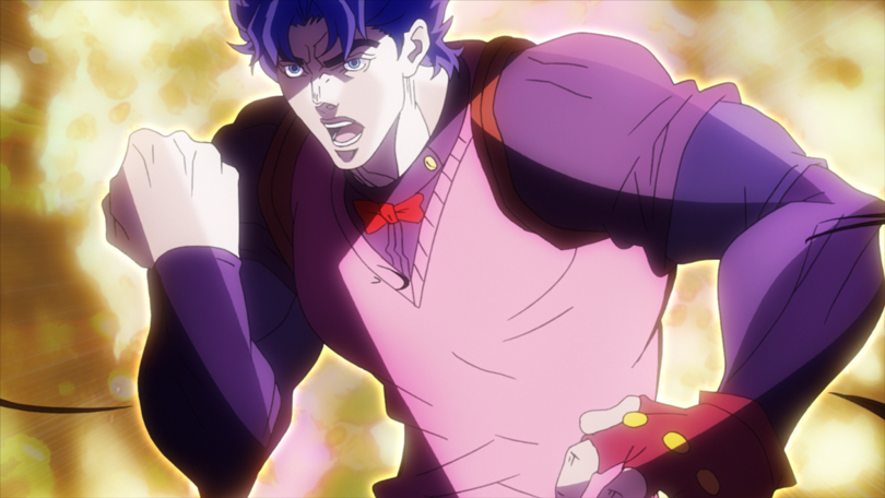
The beauty of the muscles is emphasized, but the form is slightly slimmer.
From the 19th century to the present day! Art in Transition
As the era and setting of the JoJo series changes drastically from one part to the next, the art and setting work took a lot of effort. The first season, “Phantom Blood,” is set in England at the end of the 19th century, and “Battle Tendency” is set in America and Europe before World War II. These were not depicted in a realistic way in the original manga, so in a sense they were depicted as fantasy in the anime as well. The second season, “Stardust Crusaders,” however, takes place in the 1980s in various countries and regions from Japan to Egypt. Not only the architecture, but also the ethnicity and clothing of the people who come and go are diverse, so the burden on the art team, as well as the sub-character designers, was considerable.
The team was also particular about props. For example, Suzuki, who was in charge of the script and storyboard for episodes 37-38 “The Guardian of Hell, Pet Shop,” speculated that the Porsche model in the original manga might be a limited production model commonly known as the Yellow Bird, and he incorporated that into the settings. “The enemy stand at this time was a bird, and a Porsche was running into it, so I thought that perhaps Mr. Araki had a Yellow Bird in mind at the time. Well, I’m completely imagining it (laughs).” (Suzuki) Honestly, there was no need to think so hard about a car that only appeared in a few panels in the original manga, but that is the attention to detail that love for JoJo can create.
The third season, “Diamond is Unbreakable,” is a complete change from previous seasons, and is set in the fictional town of Morioh from start to finish. Kato, the director, created a precise map of the town based on the original manga, and calculated the route to each character’s house and school, as well as the time required to get there. “I think Morioh Town is the other main character of Part 4, so I wanted to make it feel as real as possible. I spent a lot of time creating the town in order to emphasize the contrast between the scenery of rural Japan that everyone is familiar with and the heinous murders that are happening behind the scenes.” (Kato)
The fourth season, “Golden Wind,” is set in Italy in 2001. General director Tsuda and directors Yasuhiro Kimura and Hideya Takahashi traveled to Italy in July 2017 for location scouting. Kimura said, “Our goal from the beginning was to make it easy for viewers to make a pilgrimage to the holy places,” and true to his word, the fans managed to find most of the places that appear in the series. The results of this meticulous location scouting work are captured in the film, giving viewers the feeling of having traveled all over Italy with Giorno and his friends.
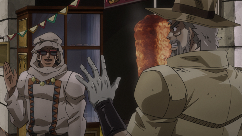
The 2nd season depicts various countries, ethnic groups, and cultures around the world.
The establishment of “JoJo-ism” in drawing
When producer Hisataka Kasama of David Production first heard about the JoJo anime project, he worried, “How many animators will be able to work with this design?” It was a big challenge for the studio. Although David Production is a studio that excels at creating strong images, they had never created a work with such a clear emphasis on muscles and skeletons. Kenichi Suzuki, who served as the series director for the first season, looking back on the situation at that time, said, “When it comes to the drawings, I had a clear image of the finished work from the beginning, but in reality, I had to get used to it as I drew it.”
Kato also said that he paid particular attention to the sense of weight in the drawing work in the beginning. “In the rugby scene in the second episode, there is a scene where Jonathan drags three players along but does not stop moving forward, which is intended to give the impression that Jonathan has grown into a powerful young man. However, Jonathan is only human and his physical strength is fundamentally different from that of Dio, who later becomes a vampire and transcends humanity. In other words, it is necessary to show the limits of humanity at the same time, and in order to do so, it had to express the weight of carrying three men on his back. The ‘swell’ created by the high load being applied to various parts of his body is very important, and I remember giving very detailed instructions on how to fix it.” (Kato)
In this way, by carefully communicating the concept for each shot, the know-how gradually accumulated, and the drawing gradually stabilized. Animator Shunichi Ishimoto has been in charge of drawing since the first season. “The JoJo series is basically characterized by dense drawings, so at first we were just drawing through trial and error, but soon there was a ‘battle of density’ among the drawing team,” he says of the drawing situation at the time.
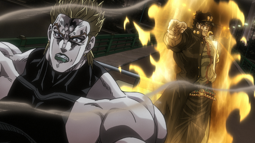
The final battle of the 2nd season has the highest level of “dense drawing” in the history of the JoJo anime.
Character acting is similar to “stage” acting?!
The acting for the characters in JoJo is not necessarily bound by common sense. In our daily lives, we don’t have the chance to pose in a unique way, nor do we have the chance to say lines like, “Do you remember how much bread you have eaten in your life?”
So the character acting in JoJo is more like theater. Suzuki says, “While there are rules regarding the placement of characters on stage and light sources, we sometimes deviate from them in order to maximize the appeal of Mr. Araki’s best panels. Suddenly, the lighting is changed, or a character is put in the spotlight. It’s like ‘Mie’ in Kabuki.” Kato refers to this as “stage acting,” and it is clear that they share the same image, even if the words are different.
On the other hand, Tsuda describes the battles in JoJo as “professional wrestling.” “In fact, JoJo’s characters are rarely worried. When professional wrestlers get into the ring, they don’t worry about why they’re fighting. They just do their best to make it fun and easy to understand for the audience with their microphone performance and exaggerated gestures. It’s the same with JoJo’s battles. By presenting what you’re going to do and then how it turned out, it makes the battles more interesting. If we prioritize the anime’s sense of showiness and speed, we’ll lose the charm of JoJo’s battles. That’s why I compared it to professional wrestling.” (Tsuda)
In Tsuda’s analysis, the real pleasure of JoJo’s battles is the groove that is created when the tempo and rhythm of long spoken lines, as well as the action, and characterization all come together, and that is what the anime is based on.
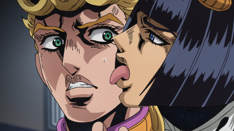
The real pleasure of JoJo battles is that they create a sense of abnormality by the unthinkable behaviors.
Interviewing and writing by Daisuke Okamoto


